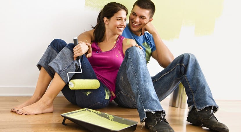
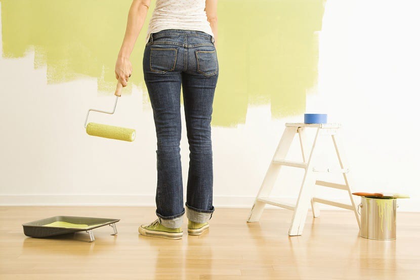
When you want to achieve good results in home decoration, you can not miss the colors on the walls. Choosing colors in furniture and textiles for decoration is essential, but it is even more important take into account the colors to paint the walls of the interiors. Today I want to talk to you about some of the best colors that you can take into account when you want to paint the interiors of your home, so if you do not know which one to choose or you feel indecisive, below you can have a small guide to the colors in trend for the next one. anus.
Colors in earth tones
The colors in earth tones is a way to have nature in your home so that you can feel calm and calm all the time. By 2016 these colors will be the dominant colors in many homes in our society. Neutral and clear colors will continue to be the protagonists ... you will have to keep in mind beige, off-white, egg yellow, etc.
The toasted and warm tones They will also make a difference in the rooms that must be balanced with furniture in light colors or with natural materials.
Bright colors
Cheerful colors will also be a trend for 2016 and it is that people want to feel good all the time. Colors can help us feel better and be more joyful, so that worries are a little away from our mind and we can focus more on the happiest feelings. It is a trend that proposes cheerful and fun colors, so that you feel like a child. Colors such as yellow, orange, mint green or lime green, turquoise, hot pink ... colors that in combination with other lighter colors can make a difference in your room.
Pastel colors
Colors in pastel shades are colors that are gaining weight in many homes thanks to everything they transmit to people. Colors in pastel tones can help you find calm, feel serene and that a room is decorated with a lot of style and elegance. The pastel colors that I personally like the most are: pale pink, green, blue, purple… And all in combination with shades like beige or white. If the colors are chosen well, great results can be achieved.
Contrasting colors
Contrasting colors will also be a trend in 2016 for interior painting. This type of color can help you create personality in the rooms and make the colors contrast creating great effects. Colors like white - black, gray - white, dark brown - pastel pink, etc. They can help you create nice contrasts. Choose the colors that you like the most to contrast and create incredible decorative effects thanks to interior painting.

How to choose the perfect color?
When you have to choose the color for a room you should think about your personal tastes, but also know which color is best for your room depending on its architectural characteristics. You should look at the orientation of the room, see if there is a lot or little natural light (If there is a lot of light you can risk colors and contrasts, but if it is not very bright it is better that you opt for pastel and light colors to help you gain visual breadth).
If your home has small rooms (even if it has a lot of light), it is better that you also opt for light colors with matte paint or with a silky texture that helps you mark depth to the room.
These are some colors that you can take into account to be able to choose the best one for your home for next year, although you should take into account above all, your personal tastes.